概述:
我想我们在使用一些App的时候,应该不会出现一些“裸控件”的吧。除非是一些系统中的软件,那是为了保持风格的一致性,做出的一些权衡。我这里并非是在指责Android原生的控件不好看,说实在的,我很喜欢Android的一些原生控件。只是有些时候为了风格的一致性,就不得不去花些功夫在美工上。这于美工这一点,我对某讯的产品的确欣赏。下面就让我们开始一点一点学习Android UI编程中的自定义控件。
分析:
自定义控件就点像堆积木,并给它涂上颜色,和功能说明。下面就让我们用一个例子来逐一地简单讨论一下。
示例分析:
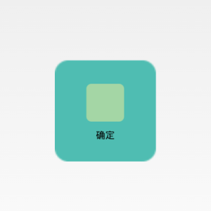
效果图展示:
本示例将选取ImageButton来做一个简单地分析。下面先来看看运行效果图:

搭建基本雏形:
对于雏形,首先要做的是积木的选择。我们选择的是一个ImageView和一个TextView,上下摆放,然后用一个约束将其绑定在一起。如下所示的代码片段:
<?xml version="1.0" encoding="utf-8"?>
<LinearLayout xmlns:android="http://schemas.android.com/apk/res/android"
    android:layout_width="fill_parent"
    android:layout_height="fill_parent"
    android:gravity="center_vertical"
    android:orientation="vertical" >
    <ImageView
        android:id="@+id/imageView1"
        android:layout_width="wrap_content"
        android:layout_height="wrap_content"
        android:layout_gravity="center_horizontal"
        android:paddingBottom="5dip"
        android:paddingTop="5dip"
        android:src="@drawable/right_icon" />
    <TextView
        android:id="@+id/textView1"
        android:layout_width="wrap_content"
        android:layout_height="wrap_content"
        android:layout_gravity="center_horizontal"
        android:layout_marginTop="5dp"
        android:text="确定"
        android:textColor="#000000" />
</LinearLayout>
上面的代码只能让我们得到一个如上所示的中间方形图和下方的文本以及紧贴在这两者边缘的一个约束。
外观设计和功能添加:
外观设计:
现在我们就要进行颜色分配和功能说明了,它被实现在Java代码中了。如下关键代码:
/**
     * 设置图片资源
     */
    public void setImageResource(int resId) {
        imageView.setImageResource(resId);
    }
    /**
     * 设置显示的文字
     */
    public void setTextViewText(String text) {
        textView.setText(text);
    }
功能添加:
而对于此我们仅仅只是让这个“Button”更好看了一些罢了。于是我们现在还要做另外一件事。例如点击后要有一些指定的、绑定死的、使用这个控件所必然会进行的操作。其实和上面的加外套是一个性质。如下关键代码:
@Override
    public void setOnClickListener(OnClickListener l) {
        auxiliaryFunction();
        super.setOnClickListener(l);
    }
    protected void auxiliaryFunction() {
        Log.i("TAG", "log message.");
    }
上面添加的额外功能,我们可以在Log日志中查看是否有真的完成。
public class ImageButton extends LinearLayout {
    private ImageView imageView;
    private TextView textView;
    public ImageButton(Context context) {
        super(context);
    }
    public ImageButton(Context context, AttributeSet attrs) {
        super(context, attrs);
        LayoutInflater inflater = (LayoutInflater) context.getSystemService(Context.LAYOUT_INFLATER_SERVICE);
        inflater.inflate(R.layout.image_button, this);
        imageView = (ImageView) findViewById(R.id.imageView1);
        textView = (TextView) findViewById(R.id.textView1);
    }
    /**
     * 设置图片资源
     */
    public void setImageResource(int resId) {
        imageView.setImageResource(resId);
    }
    /**
     * 设置显示的文字
     */
    public void setTextViewText(String text) {
        textView.setText(text);
    }
    @Override
    public void setOnClickListener(OnClickListener l) {
        auxiliaryFunction();
        super.setOnClickListener(l);
    }
    protected void auxiliaryFunction() {
        Log.i("TAG", "log message.");
    }
}
使用分析:
1.xml代码中的使用
这里只是有一点需要注意,我们要指明自定义控件的完整路径,如下:
<com.demo.customview.imagebutton.widgets.ImageButton
        android:id="@+id/btn_right"
        android:layout_width="150dp"
        android:layout_height="150dp"
        android:background="@drawable/custom_button" />
2.动作效果配置
对于Button的动作也就是触摸、按下和抬起,对于这三个动作效果的配置需要在res包下的drawable文件夹中去创建(没有这个文件夹就新建一个)。如下代码:
<?xml version="1.0" encoding="utf-8"?>
<selector xmlns:android="http://schemas.android.com/apk/res/android">
    <item android:drawable="@drawable/button_unpress_background" android:state_focused="true" android:state_pressed="false"></item>
    <item android:drawable="@drawable/button_pressed_background" android:state_pressed="true"></item>
    <item android:drawable="@drawable/button_unpress_background" android:state_focused="false" android:state_pressed="false"></item>
</selector>
3.Java代码中的使用
在Java代码的使用与Button无异,如下:
public class MainActivity extends Activity {
private ImageButton mImageBtn1;
@Override
protected void onCreate(Bundle savedInstanceState) {
super.onCreate(savedInstanceState);
setContentView(R.layout.activity_main);
mImageBtn1 = (ImageButton) this.findViewById(R.id.btn_right);
mImageBtn1.setTextViewText("确定");
mImageBtn1.setImageResource(R.drawable.right_icon);
mImageBtn1.setOnClickListener(new View.OnClickListener() {
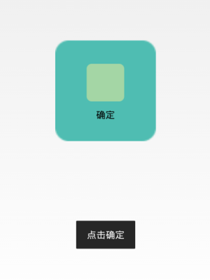
public void onClick(View v) {
Toast.makeText(getApplicationContext(), "点击确定", 0).show();
}
});
}
}
源码分享:
对于以上的分析,我想大家应该也已经完成了一个很漂亮的自定义控件。不过也有可能因为本人讲解得不够清楚,致使你没有实现想要的效果,在此也分享了本人的源代码。如下连接: