简介
本文介绍CircleProgressDialog开源库的使用及实现的详细过程,该开源库主要实现以下几个功能:
- 自定义一个好看的圆形进度条,可直接在布局文件中使用,可设置圆环宽度、圆环颜色、圆环阴影大小等属性;
- 实现自定义的dialog,用于用户等待时的显示,通过简单的代码即可直接调用显示,同时提供api进行颜色、文字等设置
通过本文可了解到自定义view的相关知识及自定义dialog的方法
github链接如下,觉得还可以请帮忙点下star~
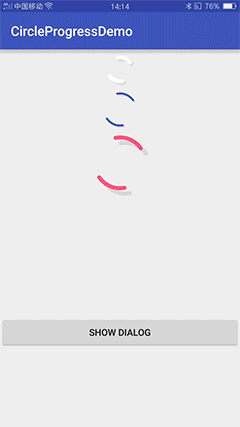
使用效果
首先看下使用效果:
有两种使用方式
布局文件中使用
提供loading_color、loading_width、shadow_offset进行设置
<com.syd.oden.circleprogressdialog.view.RotateLoading
            oden:loading_color="@color/colorAccent"
            oden:loading_width="6dp"
            oden:shadow_offset="8dp"
            android:layout_width="100dp"
            android:layout_height="100dp" />
代码中使用,对话框形式弹出
如果直接采用默认设置直接调用以下代码即可
CircleProgressDialog circleProgressDialog;
circleProgressDialog = new CircleProgressDialog(this);
circleProgressDialog.showDialog();
当然,还可以进行相关属性的设置,同时在等待的过程中可根据程序运行情况动态改变提示文字的内容及颜色
CircleProgressDialog circleProgressDialog;
circleProgressDialog = new CircleProgressDialog(this);
//可对对话框的大小、进度条的颜色、宽度、文字的颜色、内容等属性进行设置
circleProgressDialog.setDialogSize(15);
circleProgressDialog.setProgressColor(Color.parseColor("#FFFFFF"));
circleProgressDialog.setTextColor(Color.parseColor("#FFFFFF"));
...
circleProgressDialog.showDialog();  //显示对话框
//显示过程中可根据状态改变文字内容及颜色
circleProgressDialog.changeText("erro:...");
circleProgressDialog.changeTextColor(Color.parseColor("##EB0000"));
circleProgressDialog.dismiss();//关闭对话框
当然在使用前需先导入该库,仅需加入两行代码:
在工程的 build.gradle中加入:
allprojects {
        repositories {
            ...
            maven { url "https://jitpack.io" }
        }
    }
module的build.gradle中加入依赖:
dependencies {
            compile 'com.github.autume:CircleProgressDialog:1.0.0'
    }
具体实现过程
自定义view
相关知识
绘制弧:
drawArc (RectF oval, float startAngle, float sweepAngle, boolean useCenter, Paint paint)
- oval是RecF类型的对象,其定义了椭圆的形状
- startAngle指的是绘制的起始角度,钟表的3点位置对应着0度,如果传入的startAngle小于0或者大于等于360,那么用startAngle对360进行取模后作为起始绘制角度。
- sweepAngle指的是从startAngle开始沿着钟表的顺时针方向旋转扫过的角度。如果sweepAngle大于等于360,那么会绘制完整的椭圆环。如果sweepAngle小于0,那么会用sweepAngle对360进行取模后作为扫过的角度。
- useCenter是个boolean值,如果为true,表示在绘制完环之后,用椭圆的中心点连接环上的起点和终点以闭合环;如果值为false,表示在绘制完环之后,环的起点和终点直接连接,不经过椭圆的中心点。
设置矩形:
RectF rectF = new RectF(100, 100, 300, 300);
这四个参数分别代表的意思是:left top right bottom 左 上 右 下
- left : 矩形左边的X坐标
- top: 矩形顶部的Y坐标
- right : 矩形右边的X坐标
- bottom: 矩形底部的Y坐标
其实就是矩形的左上角和右下角的坐标值
首先加入自定义view的属性
我们定义了颜色,宽度,阴影偏移大小,是否显示等属性,format是值该属性的取值类型:
一共有:string,color,demension,integer,enum,reference,float,boolean,fraction,flag;
<?xml version="1.0" encoding="utf-8"?>
<resources>
    <declare-styleable name="RotateLoading">
        <attr name="loading_width" format="dimension"/>
        <attr name="loading_color" format="color"/>
        <attr name="shadow_offset" format="dimension"/>
        <attr name="loading_visible" format="boolean"/>
    </declare-styleable>
</resources>
编写自定义view–RotateLoading
预设相关属性
private final int DEFAULT_COLOR = Color.WHITE; //默认颜色
private final int DEFAULT_WIDTH = 6;
private final int DEFAULT_SHADOW_POSITION = 2;
private final boolean DEFAULT_VISIBLE = true;
private int color = DEFAULT_COLOR;
private int width = dpToPx(DEFAULT_WIDTH);
private int shadowOffset = dpToPx(DEFAULT_SHADOW_POSITION);
private boolean isStart = DEFAULT_VISIBLE;
private Paint mPaint = new Paint();
private RectF loadingRectF;
private RectF shadowRectF;
//对称的两个弧形起始角度
private int topDegree = 10;
private int bottomDegree = 190;
获取自定义属性
private void obtainStyleAttrs(AttributeSet attrs) {
        TypedArray typedArray = getContext().obtainStyledAttributes(attrs, R.styleable.RotateLoading);
        color = typedArray.getColor(R.styleable.RotateLoading_loading_color, color);
        width = (int) typedArray.getDimension(R.styleable.RotateLoading_loading_width, width);
        shadowOffset = (int) typedArray.getDimension(R.styleable.RotateLoading_shadow_offset, shadowOffset);
        isStart = typedArray.getBoolean(R.styleable.RotateLoading_loading_visible, isStart);
        typedArray.recycle();
    }
Paint初始化
private void initView() {
        mPaint.setColor(color);
        mPaint.setAntiAlias(true);
        mPaint.setStyle(Paint.Style.STROKE);
        mPaint.setStrokeWidth(width);
        mPaint.setStrokeCap(Paint.Cap.ROUND);
    }
初始化绘制弧形所需的RectF
@Override
    protected void onSizeChanged(int w, int h, int oldw, int oldh) {
        super.onSizeChanged(w, h, oldw, oldh);
        arc = 10;
        //占满界面 边距为2*width
        loadingRectF = new RectF(2 * width, 2 * width, w - 2 * width, h - 2 * width);
        shadowRectF = new RectF(2 * width + shadowOffset, 2 * width + shadowOffset, w - 2 * width + shadowOffset, h - 2 * width + shadowOffset);
    }
重写onDraw,绘出图形
@Override
    protected void onDraw(Canvas canvas) {
        super.onDraw(canvas);
        if (!isStart) {
            return;
        }
        mPaint.setColor(Color.parseColor("#1a000000"));
        canvas.drawArc(shadowRectF, topDegree, arc, false, mPaint);
        canvas.drawArc(shadowRectF, bottomDegree, arc, false, mPaint);
        mPaint.setColor(color);
        canvas.drawArc(loadingRectF, topDegree, arc, false, mPaint);
        canvas.drawArc(loadingRectF, bottomDegree, arc, false, mPaint);
        try {
            Thread.sleep(2);
        } catch (InterruptedException e) {
            e.printStackTrace();
        }
        topDegree += 10;
        bottomDegree += 10;
        if (topDegree > 360) {
            topDegree = topDegree - 360;
        }
        if (bottomDegree > 360) {
            bottomDegree = bottomDegree - 360;
        }
        if (changeBigger) {
            if (arc < 160) {
                arc += 2.5;
                invalidate();
            }
        } else {
            if (arc > 10) {
                arc -= 5;
                invalidate();
            }
        }
        if (arc == 160 || arc == 10) {
            changeBigger = !changeBigger;
            invalidate();
        }
    }
至此,圆形进度条就完成了,完整的代码可在github上查看
边写自定义dialog
编写布局文件
就是放入刚才自定义的RotateLoading,同时在下面放入一个文本
<?xml version="1.0" encoding="utf-8"?>
<LinearLayout xmlns:android="http://schemas.android.com/apk/res/android"
    xmlns:oden="http://schemas.android.com/apk/res-auto"
    android:orientation="vertical"
    android:layout_width="fill_parent"
    android:layout_height="fill_parent"
    android:background="#00000000"
    android:gravity="center">
    <LinearLayout
        android:id="@+id/llProgress"
        android:layout_width="100dp"
        android:layout_height="100dp">
        <com.syd.oden.circleprogressdialog.view.RotateLoading
            android:id="@+id/rotateloading"
            oden:loading_visible="false"
            android:layout_width="wrap_content"
            android:layout_height="wrap_content" />
    </LinearLayout>
    <TextView
        android:id="@+id/progreeTextView"
        android:layout_width="wrap_content"
        android:layout_height="wrap_content"
        android:textSize="16sp"
        android:textColor="#c0000000"
        android:text="loading..." />
</LinearLayout>
预设相关属性
public class CircleProgressDialog {
private Context mContext;
private Dialog mDialog;
//默认参数
private int dialogSize = 65;
private int progressColor = Color.WHITE;
private int progressWidth = 6;
private int shadowOffset = 2;
private int textColor = Color.parseColor("#c0000000");
private String text = "loading...";
private TextView progressTextView;
private boolean isShowing = false;
...
}
初始化配置
public CircleProgressDialog(Context context) {
    this.mContext = context;
    init();
}
private void init() {
//dialog的大小,转化成dp
float scale = mContext.getResources().getDisplayMetrics().density;
dialogSize = (int) (dialogSize * scale + 0.5f);
mDialog = new AlertDialog.Builder(mContext).create();
mDialog.getWindow().setBackgroundDrawableResource(android.R.color.transparent);
}
调用显示对话框
加载刚才的布局文件,调用自定义view的显示
public void showDialog() {
        mDialog.show();
        mDialog.setContentView(R.layout.dialog_circle_progress);
        //获取控件
        progressTextView = (TextView) mDialog.findViewById(R.id.progreeTextView);
        RotateLoading mRotateLoading = (RotateLoading) mDialog.findViewById(R.id.rotateloading);
        LinearLayout layout = (LinearLayout) mDialog.findViewById(R.id.llProgress);
        //配置相关属性
        layout.setLayoutParams(new LinearLayout.LayoutParams(dialogSize, dialogSize));
        mRotateLoading.setWidth(progressWidth);
        mRotateLoading.setColor(progressColor);
        mRotateLoading.setShadowOffset(shadowOffset);
        progressTextView.setTextColor(textColor);
        progressTextView.setText(text);
        mRotateLoading.start();
        isShowing = true;
    }
提供给用户的API
包括相关属性的set方法及两个改变文字属性的方法
public void changeText(String str) {
        if (progressTextView != null)
        {
            progressTextView.setText(str);
        }
    }
    public void changeTextColor(int color) {
        if (progressTextView != null)
        {
            progressTextView.setTextColor(color);
        }
    }
...
 public void setCancelable(boolean isCancelable) {
        if (mDialog != null)
        {
            mDialog.setCancelable(isCancelable);
        }
    }
...
ok,至此,自定义dialog也完成了。
总结
本文介绍了CircleProgressDialog开源库的使用及其实现方法,借此也介绍了自定义view及自定义dialog的方法。